You spent hours perfecting the design. The typography is tight, the colors are bold, the layout is clean. Then you drop it into a billboard mockup — and something feels off. It looks… pasted. Digital. Fake. Like a design floating in front of a photograph rather than actually living inside it.
This happens to almost every designer at some point. And the frustrating part is that the problem is rarely the design itself. It’s the mockup execution. Here’s exactly why it happens — and five fixes that will make your next billboard mockup look like it was photographed on location.
Why Mockups Look Fake in the First Place
The human eye is brutally good at detecting inconsistency. We’ve spent our entire lives looking at real objects in real light, and our brains flag anything that doesn’t follow the rules — even if we can’t articulate why.
A billboard mockup looks fake when the design inside it doesn’t respond to the world around it. The light hits the surrounding street at a 45-degree angle, but your design is lit as if it exists in a vacuum. The scene has atmospheric haze in the distance, but your artwork is pixel-perfect sharp. The environment is warm and golden, but your colors are cool and clinical.
These mismatches are small individually. Together, they scream “Photoshop.”
Fix #1: Match Your Design’s Lighting to the Scene
This is the single biggest factor separating a convincing mockup from an obvious fake. Every scene has a light source — sun angle, time of day, ambient color temperature. Your design needs to respond to it.
If the mockup scene is shot at dusk with warm orange light, add a subtle warm overlay to your artwork layer. If it’s a cloudy overcast day, cool your colors slightly and reduce contrast. The goal isn’t to dramatically change your design — it’s to make it feel like it belongs in that specific environment at that specific moment.
Fix #2: Add Realistic Shadow and Depth
Real billboards cast shadows. They have physical depth — a frame, mounting hardware, slight surface texture. When a design is dropped flat onto a mockup without any shadow interaction, it immediately reads as digital.
Use the mockup’s existing shadow layers properly. If the file doesn’t have them, add a soft multiply-blended shadow around the edges of your design area. Even a 3–5% opacity shadow along the bottom edge of the billboard panel adds surprising amounts of realism.
Fix #3: Introduce Subtle Texture and Grain
Photographs have grain. Real surfaces have texture. A perfectly smooth, grain-free design sitting on top of a photographic background creates an instant disconnect.
Add a very light noise layer over your design — 2 to 4% is usually enough. This tiny amount of grain ties your artwork visually to the photographic texture of the mockup scene and makes the whole composition feel like it came from the same camera.
Fix #4: Check Your Perspective and Distortion
A billboard viewed from street level isn’t a perfect rectangle. It has perspective — the top edge appears slightly shorter than the bottom, the left side may recede depending on the viewing angle. When a design is placed perfectly flat with no perspective distortion, it looks like a sticker, not a sign.
Use your mockup’s smart object correctly and let it handle perspective automatically. If you’re working with a tool that allows manual warping, follow the vanishing points of the scene precisely. Even slight misalignment here will break the entire illusion.
Fix #5: Use a High-Quality Mockup to Begin With
None of the above fixes will save a fundamentally low-quality mockup. If the base photo is low-resolution, poorly lit, or shot at an awkward angle with no sense of place, no amount of layer blending will rescue it.
This is where the quality of your starting material matters enormously:
- Low-resolution base photos create pixelation the moment you zoom in for client review
- Flat, overexposed scenes remove all the environmental depth your design needs to feel real
- Poorly organized files waste time and lead to mistakes when adjustments are needed
- Single-angle mockups limit your storytelling — a campaign needs to be seen from multiple perspectives to feel real
Investing in quality mockup assets isn’t a luxury. It’s the foundation everything else is built on.
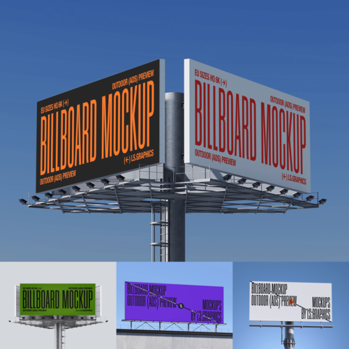
Billboard Mockups on ls.graphics: Built for Realism
If you want mockups that make fixes 1 through 4 dramatically easier — because the base quality is already doing most of the heavy lifting — ls.graphics is worth your attention.
Their billboard collection is designed from the ground up for professional presentations:
- Ultra-realistic rendering with accurate environmental lighting that makes blending your design effortless
- Organized, labeled layers so you spend zero time figuring out the file structure
- Multiple angles and perspectives — street level, elevated, side view — for complete campaign storytelling
- Different color styles and lighting variants including day, golden hour, and night scenes
- Stylish minimalistic compositions that frame your design without competing with it
- Edit Online feature — open directly in the browser, no Photoshop license required
- A generous library of free scenes to explore before committing to premium assets
Real-World Situations Where This Actually Matters
The difference between a fake-looking and photorealistic mockup isn’t just aesthetic — it has real business consequences.
Advertising agencies lose pitches when mockup presentations feel unpolished. A client who can’t emotionally connect with how their campaign will look on the street will hesitate to approve the budget. A photorealistic mockup removes that hesitation entirely.
Freelance designers working with small business clients face a similar challenge. A local restaurant owner or boutique brand has no frame of reference for what “good outdoor advertising” looks like — until you show them a mockup so convincing they start asking which street it’s on.
Event promoters, product launchers, and startup founders all face the same truth: the mockup is the campaign, until the campaign actually exists. Make it look real, and people will believe in it before it’s real.
Conclusion
A fake-looking billboard mockup isn’t just an aesthetic failure — it’s a communication failure. It breaks the client’s trust in the idea before the idea ever gets a chance to prove itself.
Fix the lighting. Add the shadow. Embrace a little grain. Respect the perspective. And start with quality material that makes all of those fixes easier rather than harder.
ls.graphics exists precisely for designers who take that last part seriously — because the best creative work deserves a presentation environment that matches its ambition.